
Share App
An app designed to make finding a nanny-share less overwhelming for busy parents.
Role
User Experience Designer (UX)
User Interface Designer (UI)
Agency
Freelance
Client
Personal project
Date
February 2023

THE PROBLEM
A trustworthy nanny is hard to find and often expensive. A nanny-share is a great option to lower the cost but having to also find a parent with the same schedule and kids in the right age range is almost impossible.
THE SOLUTION
An app that connects parents with both nannies and partner parents using filters, reviews, and a consolidated profile view that allows for quick searches and comparisons. Parents are short on time so ease is critical to the app’s success.

User Research
When I started researching for this project I was simply trying to identify The root of the childcare problems that many of my 30+ year old friends were experiencing. I used a qualitative approach with video interviews of parents. I conducted 5 user interviews with parents of 0-5 year olds. One was just starting their childcare journey and Two of those five had older kids and spoke about their past experience with childcare.
The script was designed to do one of the easiest things in the world; get parents to talk endlessly about their kids. Even though it’s 14 questions long, most items were covered by question 2. The interviews were conversational and long but provided great insight.
Script
Do you and your partner work and how often?
Tell me about your kids.
What was your experience finding childcare like?
How do you feel about the options you had to choose from?
Do you have a preferred cohort size for your childcare?
Do you have any preferences when it comes to who is supervising your children?
Was there anything you were hoping your kids would learn or do during childcare?
Do your kids ever talk about what they wish they could do in childcare?
Have you had any bad experiences with your past childcare?
Have you had any good experiences with your past childcare?
What type of after-school activities do you sign your kids up for?
Are there any activities or programs that you wish existed?
How many days would you like your kids to be in programming other than their childcare?
Anything else?

Empathy Map
Insights
Nannies are only a bit more expensive than daycares and are easier for parents that work from home. They also allow more control over what your kid learns.
Parents of single children want their child to be socialized so would rather do a nanny-share than a single nanny or would do a group daycare.
Parents have no easy way to find childcare and rely on their friends to help. It’s inaccessible for people with no local network and non-English speakers.
Parents are sad that they miss out on so much of their childrens lives and wish they had photos or stories from their daycare.
Personas
CARING CARA

“I just want my kid to have fun and feel loved.”
Empathetic mother
Age: 34
Location: Vancouver, BC
Education: College
Job: Interior designer
Salary: 60K
Family: Married, 2 sons
Bio: She’s devoted to her children but also wants to make others around her happy while meeting her personal goals if there’s time left in the day.
Personality
She’s extroverted and creative, happy to help where she can. She’s active in the community.
Goals
• Cara wants to meet neighbours to build friendships for her and her children
• She wants to find a childcare solution that’s very focused on her kids’ emotions and choices.
• She wants to give her kids cherished memories
Frustrations
• She’s busy and takes on a large mental load
• She finds it hard to find out what daycares are more focused on fun than learning
• She’s considering a nanny-share but doesn’t know any parents to recommend someone and feels like all the options are strangers.
• She feels like she’s missing out on her kid’s life by being away from them so often.
SMART SAM

“I want her to be prepared for school and have a head start.”
Logical mother
Age: 38
Location: Burnaby, BC
Education: University
Job: Operations Manager
Salary: 120K
Family: Married, 1 daughter
Bio: Sam’s a career-driven woman that’s worked hard in her life and knows that knowledge is power. She wants her kid’s life to be easier so gives her lots of tools early on.
Personality
She’s not the most social, who has time to be? She’s a planner and an academic.
Goals
• Sam wants her child to learn a second language.
• She wants to ensure their child is set up for success as much as possible.
• She wants to connect with professional moms to stay up to date on the new best thing.
Frustrations
• She’s very busy and stressed from her workday.
• She doesn’t want to have to wait on a list for the daycare she wants.
• She finds the websites out there unnecessarily complicated and wants consolidation
• She has trouble finding a career parent network.

Research outcome
The research surprisingly indicated that nannies were almost as expensive as childcare and with more parents working from home it was an inconvenience to leave the house and drop them off to group care especially when finding it close by was almost impossible. Another factor was that many families are opting to have only one child and a big priority for them is socialization. Group childcare could be risky though with a lot of them being too busy to pay your child much attention. But a nanny just for their child wasn’t ideal either especially since some parents wouldn’t have space for a nanny to be in their home.
All these factors lead me to nanny-sharing where multiple parents share one nanny that looks after their collective children. It’s economical to share a nanny, it guarantees at least one other child for a single kid to socialize with and eliminates the commute depending on where the nanny is stationed. The only problem is that it’s hard to find a nanny that you can trust as well as a parent partner that you get along with that has children of a similar age. There aren’t any easy ways to go about it other than scouring Facebook groups until you find a match which is messy and hard to track.
The path I decided to go down was a filter-based app that only showed you parents in your area with similarly aged children and nannies that are open to work. It’s an introduction app that allows you to escape social media and keep things relevant to one problem space.

Information Architecture
This site map was built in Figjam and shows the high-level flow of the app. It shows the basics such as logging in and your user profile before going into the meatier options. You’ll see two search options, one for nannies and one for parents that you would partner up with to share a nanny. You can start by looking for a nanny or looking for a parent, whichever you prefer, or even do so simultaneously. The basic task is to look through the options presented to you by swiping left or right (like dating apps) and waiting to see if you connect with them. If you do, you can chat to see if it could work out and then introduce the third party that you both like. From there, you can chat scheduling and exchange personal contact info if you’d rather proceed off the app.
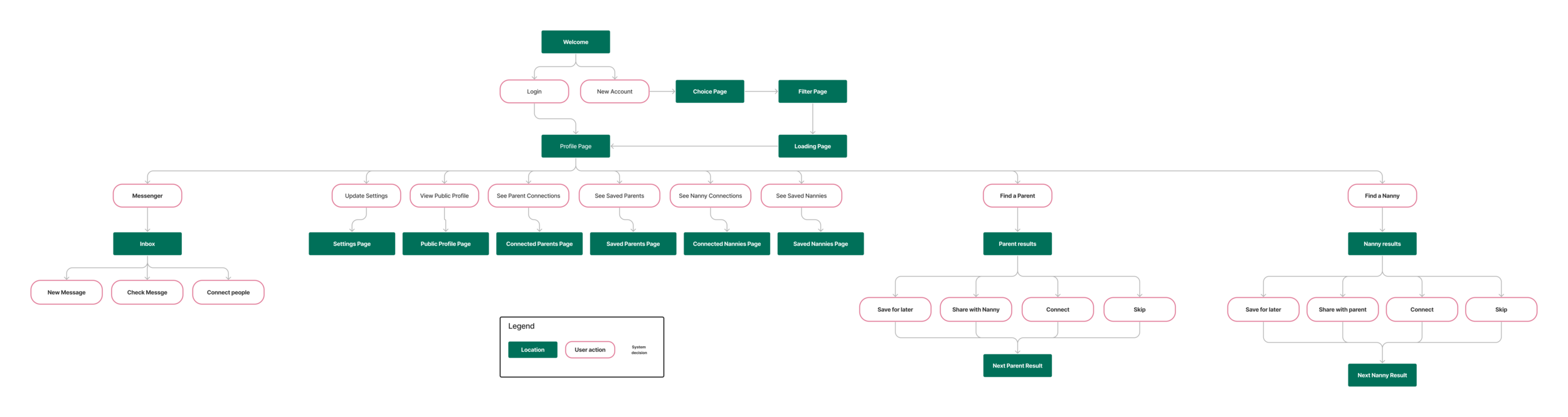
Site Map
Task Flows
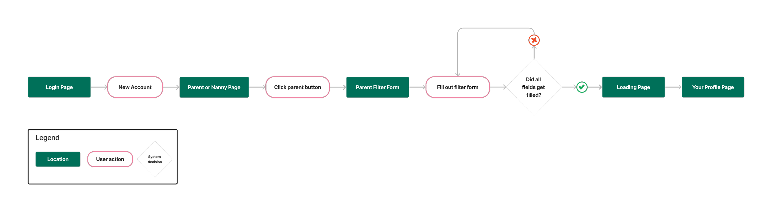
Create a new parent account
The most important task is creating your account and accurately filling out your filter for the best results. The system will block a user from proceeding without filling out the whole filter form or if their submission is invalid like an instance of a taken username.
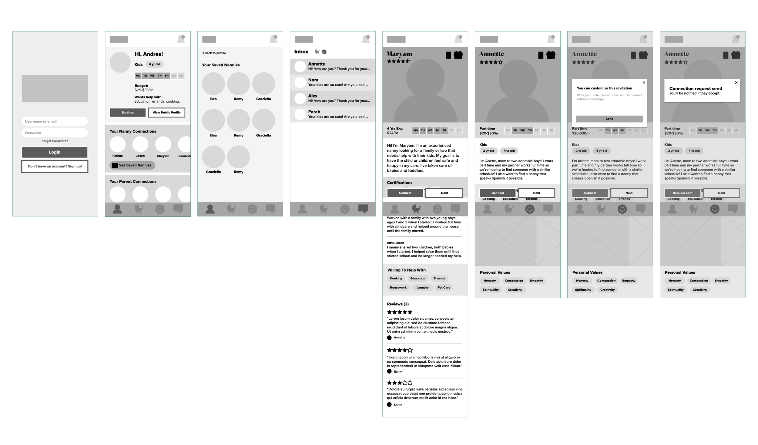
Nanny Search Task
The second task is searching for a nanny from a parent’s point of view. It shows what options a parent would have on the nanny’s profile page. You can choose to skip a nanny, send a connection request or save a nanny for later in case you can’t decide and want to review the profile later. You can also share the profile within the app with a connected parent that you think might also like that nanny. Once any of these options are completed you’re moved onto the next nanny profile.

Website Sketches
Once the structure and flows were done I began sketching the approximate layout. These are just a few examples of the process including a few from crazy eights sessions. They focus on structure and information organization.

Low-Fidelity Wireframes
The next step is playing with those sketches in a more modular setting. Using Figma I blocked out some app structures and experimented with certain layout options. My main goal was to find space for all the information I needed to include. How can I make the experience streamlined and accessible while using UX principles in a conscious way?
Knowing that I wanted it to be reminiscent of dating apps I thought about Jacob’s Law and tried to bring some similarities into the layout. The profile pages in particular share some hierarchy with dating apps like Hinge. The organization of the connections is quite different, though, since it isn’t one category of people that are being connected with but distinctly two that should be treated as such.
User Interface
After user testing the low-fidelity prototype I found there was some confusion about whether the profile they were looking at was a nanny or a parent. The user needed to read the bio to be sure. To combat this I added colour coding as well as a tag at the top of the page to help the user know where in the app they were.The users also wanted the icons to be more clear about which was the nanny vs the partner parent which was tricky to achieve considering the overlaps between the two subjects.
The users also wanted to be taken to the next nanny/parent when they finished a connection instead of having to click the next button (they worried that they skipped them entirely and removed their connection request) which was very logical so I happily implemented that change.

High Fidelity
The UI is grounded in a natural palette with a feminine pink paired with a stylish display font. Even though men will be present on the app the household mental load is often placed on the woman and that means the app’s traffic will skew female. For the same reason, I’ve softened the shapes and avoided harsh colours by using an off-black sparingly.
I left lots of white space since there’s nothing calming about compressed information and I wanted the app to be as relaxing as possible. The more inviting it is the less using it will feel like a chore. When it comes to the profiles I wanted the face of the person to be large and immediate. This app is about connecting people and it’s natural to feel more trust in someone you can see.


Brand Guide
I made a simplified brand guide that could help any assistant designers or devs keep their choices consistent.
The headline font is fashionable and bold and pairs well with the rounded and legible Proxima Nova used for the body and subhead text. The headline text would never be used for large swaths of text.
The colours are comforting and pair with a few secondary shades for a variety of online uses. The black is an off-black to soften the palette slightly.
The buttons are simple pills and show just a couple of examples of states for now.

Results
The main goal of this project was to showcase my abilities in an app setting seeing as I haven’t had the opportunity to work on one in my career yet. It was honestly a lot of fun to work within the restrictions and, though I could keep digging into this, think it successfully serves its purpose at this stage.
Learning Outcomes
Every time I thought I was close to done there was another angle to consider. An app of this complexity requires a lot of exploration and as much as I wanted to find every if-this-than-that scenario I didn’t want to over-invest in a personal project. If I did this again I would spend a bit more time user testing but it was hard to get busy adults to participate multiple times without a reward. The value of a fresh set of eyes is unparalleled though. This project was a great exercise in UX principles and had me considering the difference between influence and mimicry quite a lot as I pulled from existing sources to make the user experience familiar. I also wanted to focus on accessibility ensuring font sizes and contrast levels were good enough while still testing those boundaries. I think if I did it again I would focus even more so on that by practicing with a screen reader to see how things translated and by adding in more responsive interactions such as a bell animation or scroll-end animations.