
GVS
A brand identity and website designed to make getting help more accessible and approachable for those in need.
Live site: gvssupport.ca
Role
Branding and client services
User Experience Designer (UX)
User Interface Designer (UI)
Agency
OK Dave
Client
Gastown Vocational Services (GVS)
Date
March 2022

THE PROBLEM
GVS needed a consistent online presence with better visibility and clarity of who they are and what they do. They found that users would contact them immediately with lots of questions instead of reading those answers on their website and their internal team was being overwhelmed with the communications.
THE SOLUTION
Update GVS’s site and brand to be more modern and simple, keeping the copy as conversational and succinct as possible. The result should be inclusive, evoke trust and compassion, and show business integrity.

Branding & Visual Design
GVS helps guide struggling people through their present circumstances and into a brighter future. They want their brand to be a safe space, somewhere for people in crisis to land and take a breath. Somewhere brighter than their current murky life while still being taken seriously as a professional resource. It needs to be clear and concise to prevent becoming one more hurdle for them to get over. Basically, not another confusing government website.

Logo design is always a process and often results in an amalgamation of several options. Here you can see a few versions of the early stages of design and how bits and pieces were pulled from each to make the final brand.
The new brand is approachable, modern, and optimistic with bright and playful graphics and colours. The logo is rounded and full of personality with a subtle arrow in the “G” to imply continuation—a theme of the graphics as well. The twists and turns of life are represented in the line work and the last line must point up to keep the metaphorical story positive, showing hope.


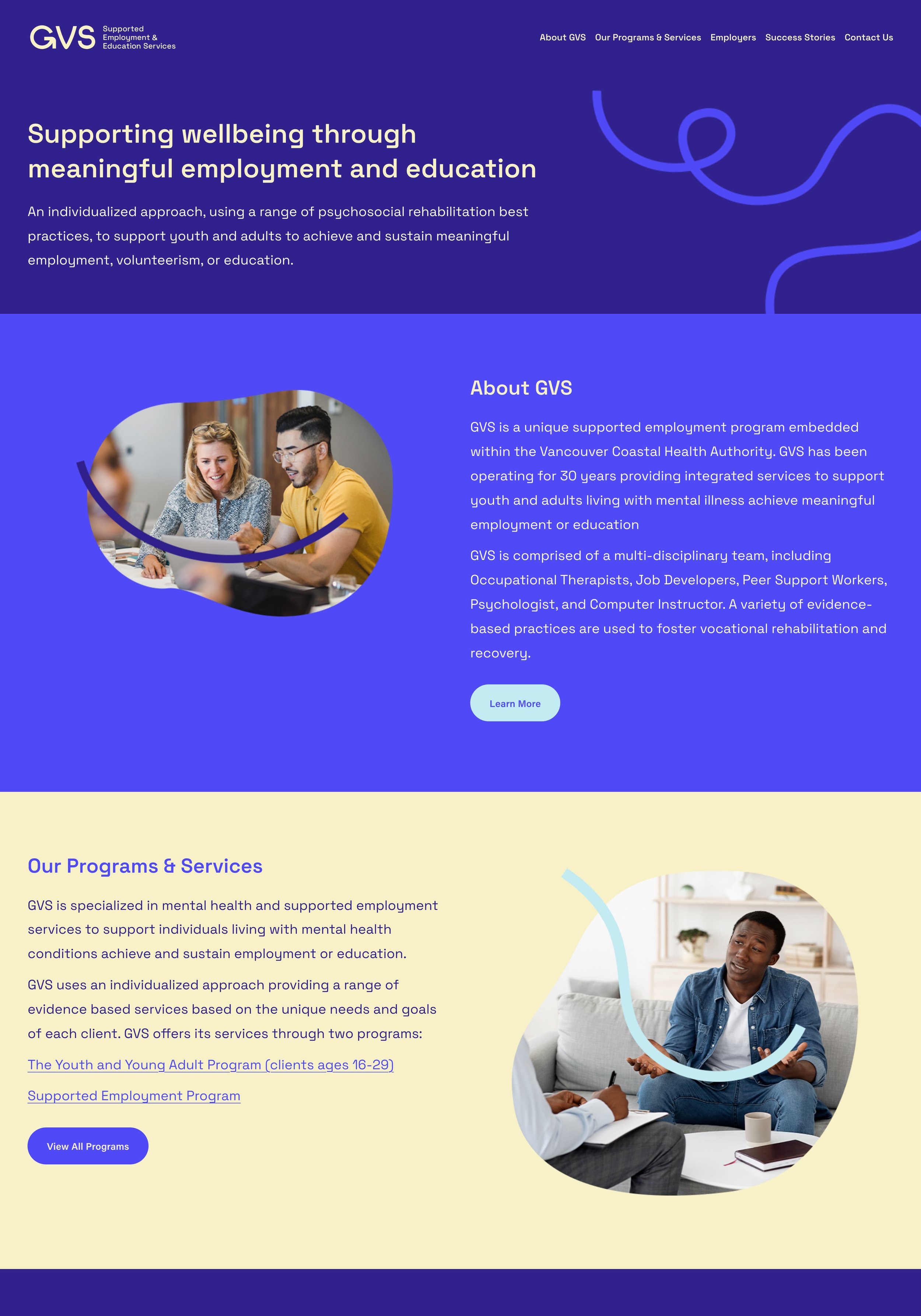
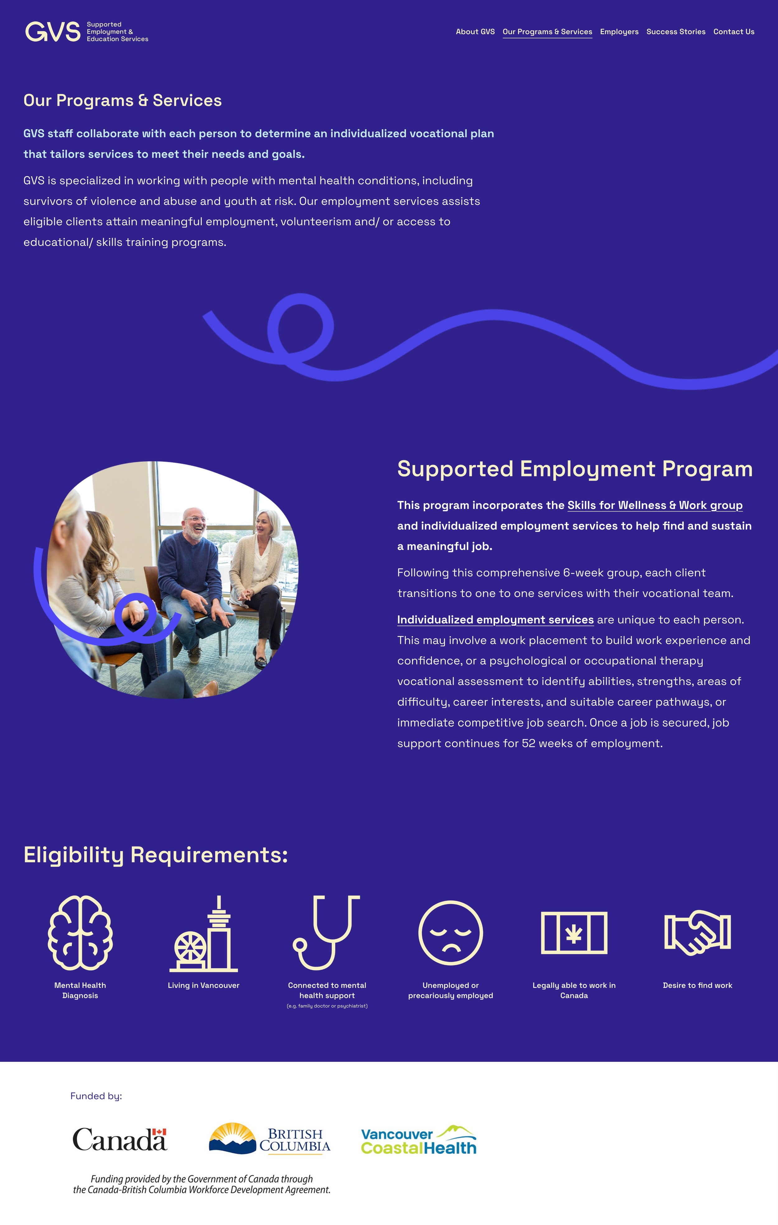
Website Design

The original GVS website had a confusing and outdated structure and an unapproachable amount of copy per page. We know from research done at organizations like the APA that attention spans are limited and, since their current target market is youths, the content needs to be concise and eye-catching. Let’s start off with some before and after.

Website Sketches
I experimented with a few ways to balance the text with imagery in a digestible way. I used white space to avoid overwhelming the user but not so much that it would take ages to find what you need. I sketch until I find a successful jumping off point to being the wireframe build.


Wireframes
I worked alongside the client to help them understand the importance of narrowing down their copy and ensuring that it’s user-focused. Even though a lot of their original content was useful it was mostly for the intranet of their company. Once we redefined who they were talking to with their copy it became a lot more concise.
Using the Laws of Proximity, Similarity, and Connectedness, I broke the content into chunks to make scanning for the information you need easier. Allowing these chunks to live independently from the rest of the content allows them to be digested quickly.
High Fidelity Website
The live site can be found at gvssupport.ca
We tested the wireframes in a small user group and found that most completed their tasks successfully. There was some feedback on the large image blocks used on the programs page (which were initially made to have the two programs stand out) added confusion due to their horizontal layout being similar to the way the chunks of content had been sectioned out. The users felt like it was a subsection. We pivoted that design to mirror the more successful image placements on the site.
The UI helps add to the content separation with addition of colour blocks. The colours and photos help give the website a cleaner and more modern look that will help retain users and keep engagement high.

Results
The client loved the result and immediately heard positive feedback from their partners. They “are so pleased with the way this redesign turned out” and found me to be “an absolute joy to work with”. While we didn’t do any follow up research with their customer base, I’m confident that this site made their user’s search for help easier.

Learning Outcomes
While I love the outcome of this project, I think I underestimated the client’s ability to work with Squarespace. I designed the site to be accessible to their skill level since they’re a low-budget business and needed to be able to do any content updates themselves. This meant repeating layouts and keeping things simple. However, they were very quick to learn the editing process when I coached them through it and I think I could have pushed the design further. I had worked with other clients in the past that were less receptive to learning these new types of skills and I lumped them into that category without exploring their individual capabilities. I neglected to research them like I would a user of a website. Next time, I’ll start by assessing the clients potential to see how far I can push the design from that starting point instead of using my own assumptions.