
Enfamil
B2C and B2B websites that help inform on the causes of and solutions to the Allergic March.
Role
User Experience Designer (UX)
User Interface Designer (UI)
Agency
Edelman
Client
Enfamil (Mead & Johnson)
Date
June 2019

THE PROBLEM
Mead & Johnson’s Enfamil has a goal of curbing infant allergy growth. They needed to share the effects of and solutions to the Allergic March with both physicians and the general public.
THE SOLUTION
Build one B2C site that’s digestible and bright and another that’s B2B with all the content that medical professionals need to make informed decisions.

B2B vs B2C
Each site had to meet certain goals. The B2B site had a lot of content and, while they still wanted some icons and infographics, they needed the site to feel professional. The B2C site, however, needed to present the allergic march as friendly as possible. They wanted to educate parents, not deprecate their parenting skills.
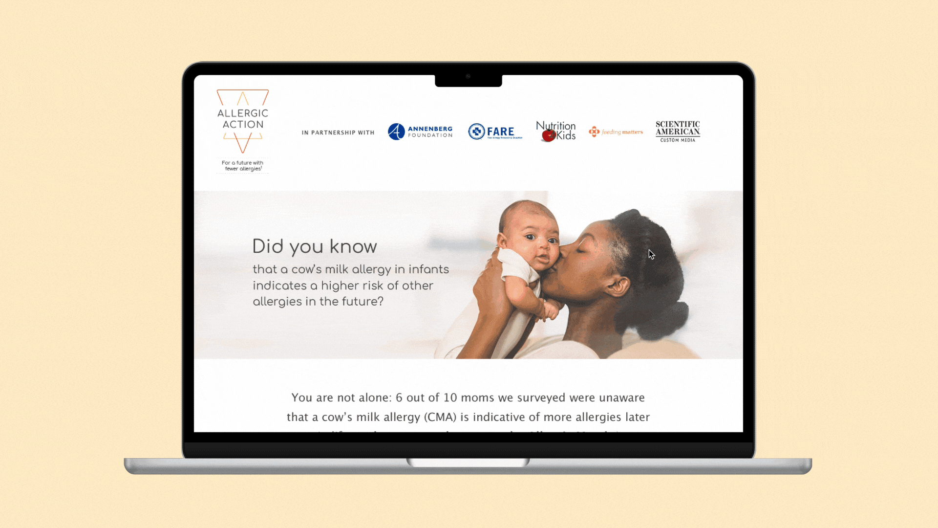
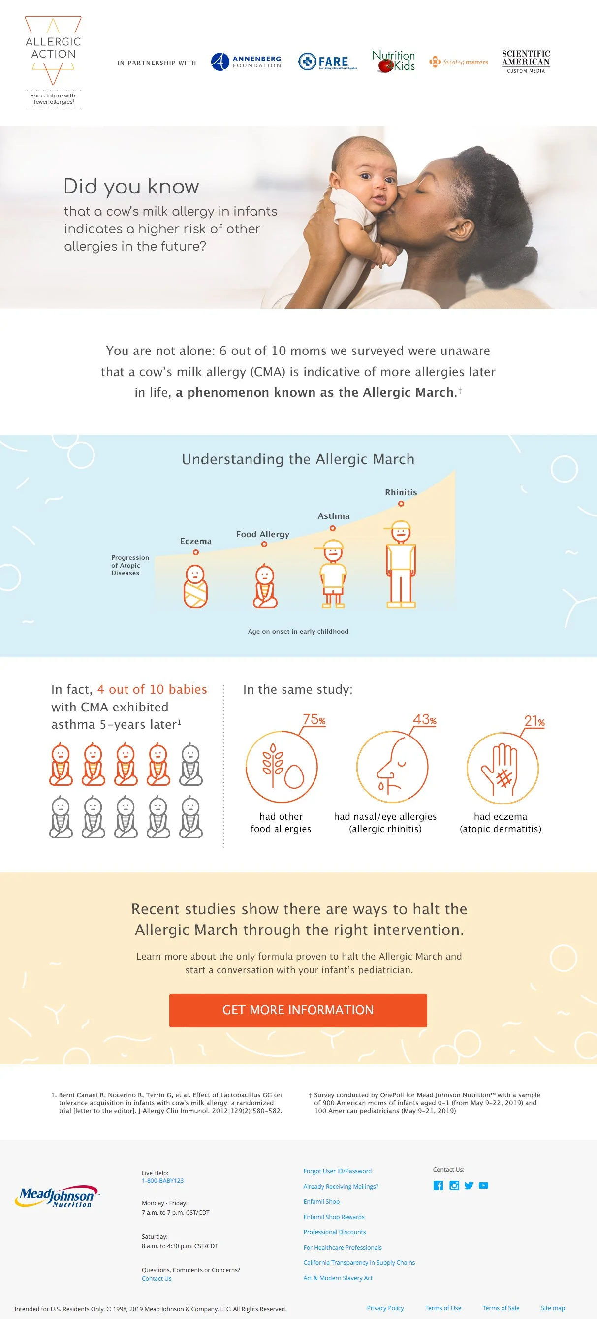
B2C Website
The B2C site uses soft colours to help ease the parents into this new information. The icons are more illustrative and paired with stylized bacteria-like texture on the solid backgrounds to lighten the text.
Ultimately they wanted parents to reach out to a professional if they were interested in learning more. There ended up being a lot of versions while the client was deciding on how much info to provide parent-side. You may be able to tell by looking at these two versions side by side that they ended up paring it down quite a lot.
To my surprise, they took away almost all the buttons despite this being a landing page with no header or other pages. They also removed entire swathes of info including a video. They decided that providing parents with an overview of the allergic march with one clear CTA was what they wanted.
B2B Website
The B2B site had a lot of content and, while they still wanted some icons and infographics, they needed the site to feel professional. The B2C site however needed to present the allergic march as friendly as possible. They wanted to educate parents, not deprecate their parenting skills.
The B2B site has a more subdued tone to ensure it’s taken seriously. The partnerships are top of the hierarchy to enforce the legitimacy of the research right away. While the icons are in the same style in both versions of the site the content is much more scientific and anatomically correct in the B2B. Buttons linking out to external sources helped lighten the text load and photography balanced out the rest.

Results
The client loved the final design so much that they ended up enlisting me for another project immediately after. It was very interesting to work with such a large medical company and I think my flexibility with changes really appealed to them.
Learning Outcomes
I learned a lot about how the medical sector works from this project. It’s an industry with many tiers of stakeholders meaning lots of review and approval rounds. This caused some frustration initially but it actually ended up being an excellent teaching moment where I learned to let go of my expectations. I had always done this but not to this degree where entire overhauls of information would happen moments after a design was done. This is just the way larger corporations work so you either adapt or you get into more boutique design studios where the clients are fish, not whales. I pride myself on my adaptability and the client specifically praised how easy I was to work with which felt great. If I could change anything about the result I would put my current knowledge of accessibility to work. Some font colours are not readable enough.